The OWFR News Hub is a special area of the OWFR website where the communications team can
publish and manage all news articles, press releases, newsletters, featured initiatives, and ministry
communications, without needing to write any code or ask a developer.
Think of it as a self-contained bulletin board built directly into WordPress. Everything you create
here appears instantly and automatically on the public-facing "News & Updates" page of the website,
organized into clean tabs that visitors can browse.
What can the News Hub display?
News articles with a title, description, date, and a "Learn More" button
Downloadable documents (PDFs, Word files) in English and/or French
Partner logos displayed at the top of a card
Photos or images associated with a story
Links to external websites
The current issue of The Currents newsletter
The four default sections
All items are organized into one of four tabs on the public page:
Section Name
What belongs here
News Releases
Official press releases and announcements from OWFR or partner organizations
Newsletters
The current issue of The Currents newsletter (one card, managed separately)
Featured Initiatives
Spotlight stories, projects, and programs the team wants to highlight
Ministry Communications
Updates, memos, and communications from the Ministry of Health
2
How it looks on the website
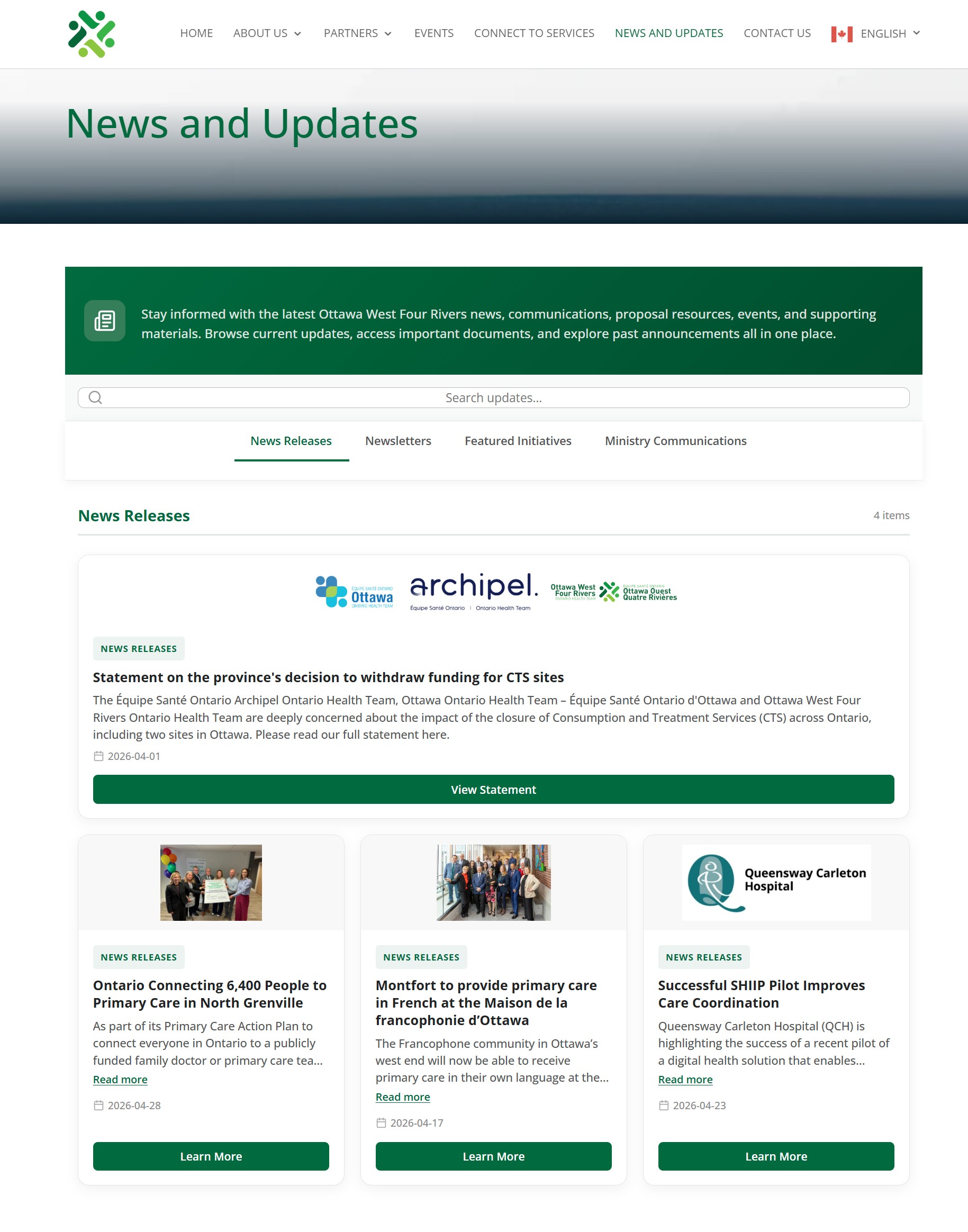
When visitors navigate to the News & Updates page, they see the following from top to bottom:
Hero banner: A green header bar at the top with a title ("News & Updates") and
a short introductory sentence. This text can be edited directly on the page if you are logged in.
Search bar: Visitors can type a keyword to instantly filter all items across all sections.
Results update live as they type.
Section tabs: Four tabs (News Releases, Newsletters, Featured Initiatives, Ministry Communications).
Clicking a tab shows only the items in that category.
Cards: Each news item appears as a rectangular card with an optional image or logos,
a category badge, the title, a short description, the date, and one or more action buttons (e.g. "Learn More", "Download").
What visitors see vs. what editors see
Logged-in editors (you) see additional pencil ✎ and × icons floating on each card, letting you edit or delete
items right there on the page. Regular visitors never see these icons.
3
Accessing the Admin Dashboard
The Admin Dashboard is your central control panel. You reach it through the WordPress back-end, which is
the area you log into to manage the website.
Log in to WordPress at ottawawestfourrivers.com/wp-admin using your username and password.
In the left-hand sidebar, look for the megaphone icon labelled News Hub and click it.
You are now on the News Hub Dashboard page.
Note: Don't see "News Hub" in the menu?
Only users with the Editor role or higher can access it. If it is missing, ask your WordPress
administrator to check your user role.
4
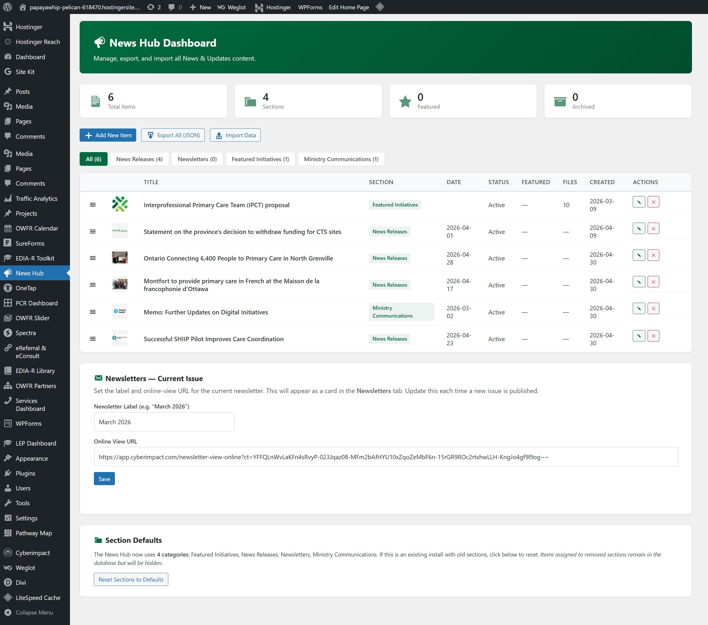
Dashboard Overview & Stats
The top of the Dashboard shows four summary boxes that give you a quick snapshot of your content:
Box
What it shows
Total Items
How many news items exist in the system in total (all sections, all statuses)
Sections
How many category tabs currently exist
Featured
How many items are currently marked as Featured (pinned to the top)
Archived
How many items have been archived (kept but not visible to the public)
The three main action buttons
+ Add New ItemExport All (JSON)Import Data
Add New Item: Opens the form to create a brand-new news card. See Section 5 for full details.
Export All (JSON): Downloads a backup file of all your content. See Section 17.
Import Data: Restores content from a previously exported backup file. See Section 17.
The items table
Below the buttons is a table listing every news item you have created. Each row shows:
Column
Meaning
⠿ (dots icon)
Drag handle: click and drag this to reorder items within the table
Thumbnail
A small preview of the item's image (if one was added)
Title
The headline of the news item
Section
Which tab this item belongs to
Date
The event/publication date entered for this item
Status
Whether the item is Active, Archived, or Hidden
Featured
Yes (marked with a star) if the item is pinned as featured
Files
How many downloadable files are attached
Created
The date the item was first added to the system
Actions
✎ Edit button and ✕ Delete button
Section filter tabs (above the table)
Above the table you will see a row of tabs: All, then one tab for each section.
Click a section tab to filter the table to show only items from that section, which is useful when you have
a long list and want to focus on one category at a time.
5
Adding a New Item
You can add a new item in two ways; both open the same form:
From the Dashboard: Click the green + Add New Item button at the top.
Directly on the website: When you are logged in and browsing the News & Updates page,
you will see a "+ Add New Item" tile at the end of each section's card grid.
Clicking it opens the same form, pre-set to that section.
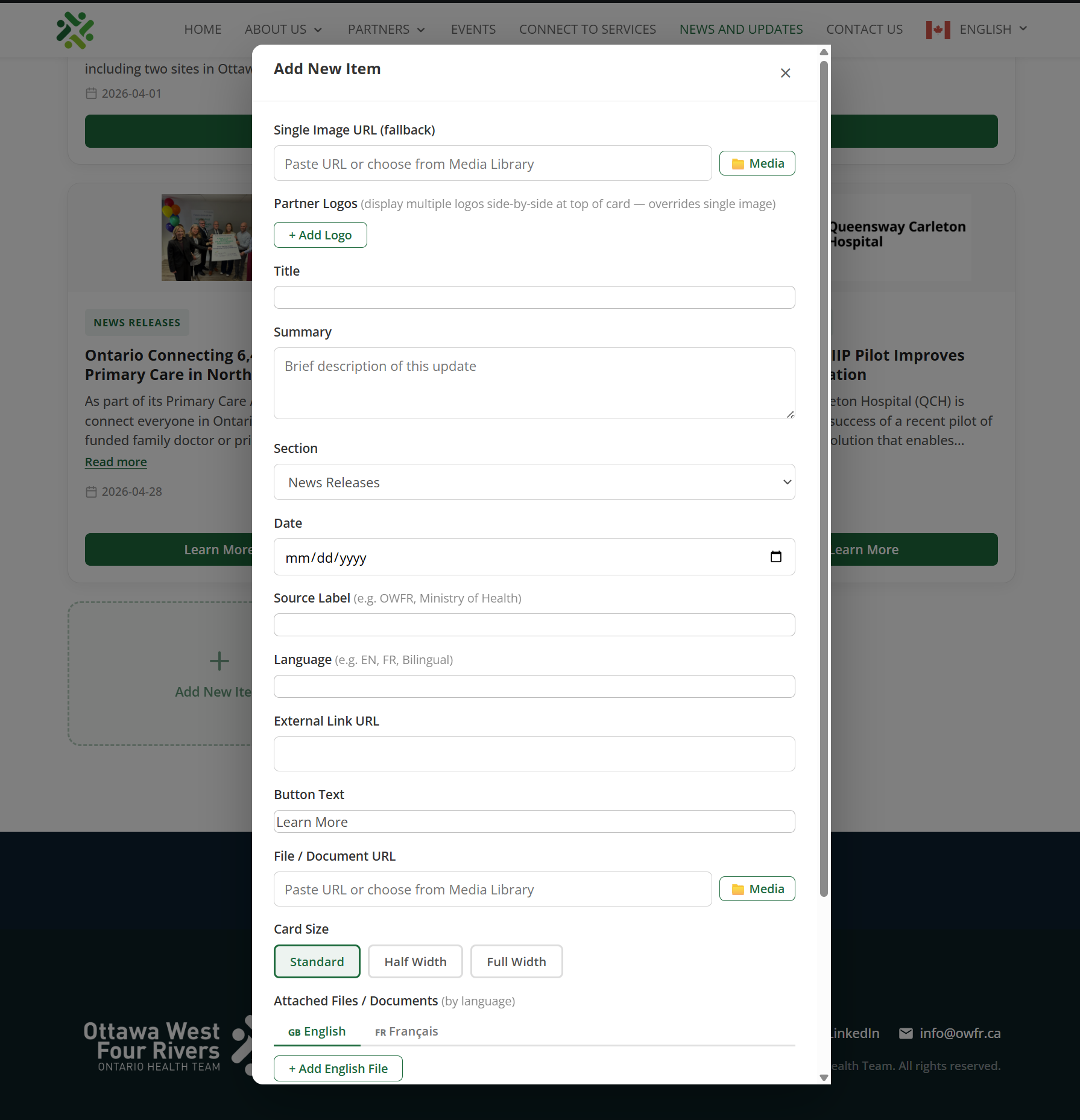
A panel slides in from the right side of the screen with all the fields. Fill in whatever is relevant
for your item, then click Save at the bottom. The item appears on the website immediately.
Note: You don't have to fill in every field.
Only Title and Section are strictly required. Everything else is optional, so
add only what makes sense for each piece of content.
6
Every Field Explained
When you open the "Add New Item" or "Edit Item" form, you will see the following fields.
Required fields are marked in red;
all others are optional.
Basic Information
Title Required
The headline of the news item, shown in bold on the card. Keep it concise and clear.
Example: "Ontario Connects 6,400 People to Primary Care in North Grenville"
Summary Optional
A short paragraph that appears directly under the title on the card. Aim for 1–3 sentences.
If the text is too long to fit in the card preview, a "Read more" link will appear automatically
so visitors can expand it.
Think of the summary as what you would read in a news feed, with enough detail to understand
what the story is about without reading the full article.
Section Required
A dropdown menu that assigns this item to one of the four category tabs on the website.
Choose the one that best fits the content:
News Releases: Press releases and official announcements
Featured Initiatives: Spotlighted projects and programs
Ministry Communications: Ministry updates and memos
(The Newsletters tab is managed separately; see Section 14.)
Date Optional
The publication or event date, shown on the card with a small calendar icon.
Use the date picker to choose a date, or type it in YYYY-MM-DD format
(e.g. 2026-04-28).
Source Label Optional
A short tag shown near the date, indicating where the news came from.
Examples: OWFR, Ministry of Health, QCH, Montfort.
Language Optional
A small badge shown on the card indicating the language of the content.
Examples: EN, FR, Bilingual.
Use this when a resource is available only in one language.
Images & Logos
Single Image Optional
A photo or illustration displayed at the top of the card. You can either:
Paste a web address (URL) for an image that is already online, or
Click the 📁 Media button to choose a file you have already uploaded to WordPress.
Note: if you add Partner Logos (below), they will replace this single image.
Partner Logos Optional
Add one or more organization logos to display side-by-side at the top of the card.
This is useful for joint announcements involving multiple organizations.
Click + Add Logo to add a row.
Paste the image URL or click 📁 to choose from the Media Library.
Click the red × to remove a logo row.
You can add as many logos as needed.
Use this when you want the Queensway Carleton Hospital logo and OWFR logo both shown
at the top of a joint press release card.
Bottom Image Optional
A secondary image that appears at the very bottom of the card, below all the buttons.
Used occasionally for infographics or additional visual content. Works the same way as the Single Image field.
Links & Downloadable Files
External Link URL Optional
The web address the main button on the card should take visitors to. This is usually the full
article, announcement, or resource page on an external website.
Example: https://news.ontario.ca/en/release/…
Button Text Optional
The label that appears on the main green button. Defaults to "Learn More" if left blank.
You can customize it. Examples: "Read the Full Release", "Visit the Website",
"Register Now".
File / Document URL Optional
A direct link to a single file (PDF, Word document, etc.) that will create a
Download button on the card. For most documents, use the
📁 Media button to select a file you have already uploaded to WordPress.
Use "Attached Files" (below) instead if you need to attach multiple files
or want separate English and French versions.
Attached Files Optional
A more powerful way to attach files: allows multiple files, organized by language (English / French).
The form shows two tabs: English and French (Francais).
For each file:
Click + Add English File (or French) to add a row
Enter a Label: the name that will appear as the link (e.g. "Annual Report 2025")
Paste the file URL, or click 📁 to pick from the Media Library
Click the red × to remove a file row
Files added here appear as a neat list of download links grouped by language on the card.
Display Options
Card Size
Controls how wide the card appears in the grid. Three choices:
Standard: One-third of the page width (default, shows 3 cards per row on desktop)
Half Width: Half the page width (shows 2 cards per row on desktop)
Full Width: Stretches across the entire page (one card per row)
Click the size you want. The selected option will be highlighted.
Use Full Width for the newsletter card or for a major featured story that deserves
more visual space.
★ Featured Item
A checkbox. When ticked, this item is marked as featured. It gets a subtle gold/green border
and a "★ Featured" badge on the card, helping it stand out visually.
Featured items are also counted in the Dashboard stats.
Status
Controls whether the item is visible to the public. Three options:
● Active● Archived● Hidden
Active: Visible on the public website
Archived: Kept in the system but not shown publicly (good for old items you may need to reference again)
Hidden: Completely invisible; useful for items being drafted or not yet ready to publish
7
Editing an Existing Item
You have two ways to edit an item:
Option A: From the Admin Dashboard
Go to the News Hub Dashboard (WordPress menu → News Hub).
Find the item in the table. Use the section filter tabs to narrow it down if needed.
Click the ✎ (pencil) button in the Actions column on the far right.
The edit form opens. Make your changes.
Click Save. The website updates immediately.
Option B: Directly on the website (inline editing)
Make sure you are logged in to WordPress.
Visit the News & Updates page on the website.
Hover over any card; a ✎ pencil icon will appear in the top-right corner of the card.
Click the pencil icon to open the edit form for that card.
Make your changes and click Save.
Both methods edit the same item.
Changes are saved in real time; there is no draft system. As soon as you click Save, the update
appears on the live website.
8
Deleting an Item
⚠️ Deletion is permanent.
Once deleted, an item cannot be recovered. If you are unsure, consider archiving the item
instead (set Status to "Archived"). It disappears from the public website but stays in the system.
To delete from the Admin Dashboard:
Find the item in the Dashboard table.
Click the ✕ button in the Actions column.
A confirmation prompt will appear asking you to confirm. Click OK to permanently delete.
To delete directly on the website:
While logged in, visit the News & Updates page.
Hover over the card you want to remove; the ✕ (delete) icon will appear alongside the pencil icon.
Click the ✕ icon and confirm the prompt.
9
Item Statuses
Every item in the News Hub has a Status that controls its visibility.
Understanding this is important for managing older or sensitive content.
● Active● Archived● Hidden
Status
Visible to the public?
Appears in Dashboard table?
When to use
● Active
✅ Yes
✅ Yes
The item is published and live. Normal state for all current content.
● Archived
❌ No
✅ Yes
The item is past its relevance but you want to keep it on file. Example: last year's annual report.
● Hidden
❌ No
✅ Yes
The item exists but should not be seen; use for drafts or items awaiting approval before going live.
To change a status, edit the item (either from the Dashboard or inline on the website) and change the
Status dropdown to the desired option, then click Save.
10
Pinning an Item as Featured
Marking an item as Featured gives it a special visual treatment on the website:
it receives a gold/green left border and a ★ Featured badge
so it stands out from the rest of the cards.
Featured items are still shown in the same section as other items; they are not moved to a separate area.
To make a featured item appear at the top of its section, you should also drag it to the first position
(see Section 12 on Reordering).
How to feature an item:
Open the item's edit form (from the Dashboard or by clicking the pencil icon on the website).
Scroll to the bottom of the form and check the box labelled ★ Featured Item.
Click Save.
To unfeature it, uncheck the same box and save again.
11
Card Sizes & Layout
The News Hub supports three card sizes. On a desktop computer, the cards are displayed in a
12-column grid; here is how each size fills that grid:
Size Name
Width
Use case
Standard
1/3 of the page (3 cards per row)
The default for all regular news items
Half Width
1/2 of the page (2 cards per row)
When you want slightly more space; good for items with longer summaries
Full Width
Full page width (1 card per row)
Major announcements, the newsletter card, or content with a wide image
Cards automatically stack on mobile.
On phones and small tablets, all cards, regardless of their size setting, stack into a single
column for easy reading. The size setting only affects how they look on larger screens.
To change a card's size, edit the item and click the desired size option in the
Card Size selector in the form. The selected size is highlighted with a green border.
12
Reordering Items
You control the order in which cards appear within each section. By default, items appear in the
order they were added. You can change this whenever you like.
Reordering from the Admin Dashboard:
Go to the News Hub Dashboard.
Use the filter tabs above the table to show one section at a time.
Click and drag the ⠿ (six-dot grid icon) on the left side of any table row
to a new position.
After dragging, a green "Save New Order" button will appear. Click it to apply the new order.
Reordering directly on the website:
While logged in, visit the News & Updates page.
You will see drag handles (⠿ or grip icons) on the cards while in edit mode.
Drag cards to the desired position. The new order saves automatically.
Important: Don't forget to Save the order from the Dashboard!
After dragging rows in the Dashboard table, the Save New Order button must be clicked or
the change will be lost when you leave the page.
13
Managing Sections (Tabs)
Sections are the category tabs shown across the top of the News Hub (News Releases, Newsletters,
Featured Initiatives, Ministry Communications). The system comes with four default sections,
but these can be adjusted.
Caution when changing sections.
If you rename or delete a section, any items assigned to that section will no longer be visible
on the website (they are not deleted, just temporarily hidden until reassigned). Approach with care.
Adding a new section (while on the website):
While logged in, visit the News & Updates page on the website.
At the far right of the section tabs bar, look for a + button.
Click it, enter a name and choose an icon, then save. The new tab appears immediately.
Deleting a section (while on the website):
While logged in, visit the News & Updates page.
When in edit mode, each section tab has a small × next to its name.
Click the × to delete the section. Items assigned to it will be hidden until moved to another section.
Resetting sections to the default four:
Go to the News Hub Dashboard.
Scroll to the bottom section titled Section Defaults.
Click "Reset Sections to Defaults".
This restores the four default sections in the correct order: News Releases, Newsletters, Featured Initiatives, Ministry Communications.
The Reset button is your "undo" for sections.
If someone accidentally adds, renames, or deletes a tab and things look wrong on the website,
clicking Reset Sections to Defaults will fix it immediately.
14
Updating the Newsletter
The Newsletters tab on the website displays a single, special card for the current
issue of The Currents. This card is managed separately from regular news items; it uses
a fixed design with the OWFR logo and a "View Online" button.
Each time a new issue is published, you need to update two things: the label
(the month and year shown on the card) and the URL (the link to the online version).
How to update the newsletter card:
Go to the News Hub Dashboard.
Scroll down to the section titled "Newsletters: Current Issue".
In the Newsletter Label field, update the month and year.
Example: change "March 2026" to "April 2026".
In the Online View URL field, paste the new link from your email platform
(e.g. from Cyberimpact or Mailchimp).
Click Save.
Where do I find the newsletter URL?
When you send a newsletter through Cyberimpact (or similar), there is usually a
"View online" link at the top of the email. Right-click that link and copy the address.
That is the URL to paste here.
The newsletter card always shows only the current issue.
Previous newsletters are not automatically kept as archive cards. If you want to preserve older
issues, add them as regular items in the Newsletters section before updating the current URL.
15
Editing Content Directly on the Website
One of the most powerful features of the News Hub is inline editing. You can
add, edit, reorder, and delete content while looking at the live public page.
This is often faster than going through the Dashboard.
You must be logged in to see the editing tools on the website.
If you cannot see pencil icons or drag handles, make sure you are logged in to WordPress.
What you can do directly on the website:
Action
How to trigger it
Edit any card
Hover over the card → click the ✎ pencil icon in the corner
Delete any card
Hover over the card → click the ✕ icon in the corner
Add a new card to a section
Click the + Add New Item tile at the end of any section's card row
Reorder cards
Drag and drop cards by their grip handle
Edit the hero title & intro text
Click the ✎ pencil icon that appears on the green hero banner at the top
Add or delete a section tab
Use the + at the end of the tab bar, or the × on a tab
Editing the Hero banner:
The green banner at the very top of the News Hub page has a title and a short introduction sentence.
When you are logged in, hovering over the banner reveals a pencil icon. Click it to open an edit form
where you can change the title and the intro text. Click Save when done.
16
The Search Bar
The search bar at the top of the News Hub page allows any visitor (and you) to search across
all sections at once. As soon as someone starts typing, the cards are filtered live
to show only those that match the search term.
The search looks through the title, summary,
source label, and section name of every item.
A small counter (e.g. "4 results") appears next to the search box to tell visitors how
many matching items were found. Clearing the search field returns all items.
The search bar can be turned on or off.
If your team ever decides to hide the search bar from visitors, this can be done through the
plugin settings (requires a developer to adjust the plugin settings option).
17
Backup, Export & Import
The News Hub includes a simple backup system so you never have to worry about losing your content.
All your items, sections, and settings can be exported to a single file and restored at any time.
Exporting (creating a backup)
Go to the News Hub Dashboard.
Click the ⬇ Export All (JSON) button.
Your browser will automatically download a file named something like owfr-news-hub-export.json.
Save this file somewhere safe: a shared drive, your desktop, or an email to yourself.
When should I export?
It is good practice to export a backup before making major changes, for example before a
large batch of updates, before resetting sections, or at the end of each month.
Importing (restoring from a backup)
Important: Import replaces all existing content.
When you import a backup file, all current items and settings are replaced with the
content from the file. Make sure you have a fresh export before importing.
Go to the News Hub Dashboard.
Click the ⬆ Import Data button. An import panel will appear.
Either click Choose File and select your saved JSON backup file,
or paste the contents of the JSON file directly into the text area.
Click Import & Replace.
A confirmation message will appear once the import is successful. The page will reflect the restored content.
What the backup file contains
The exported JSON file contains:
All news items (title, summary, dates, links, files, images, statuses)
Section definitions (names and order)
Item ordering within each section
Plugin settings (colours, newsletter URL and label, hero text)
You do not need to understand the contents of the file. Just keep it safe and use it to restore
if anything goes wrong.
18
Tips & Best Practices
Writing good summaries
Aim for 2-3 sentences, enough to tell visitors what the item is about.
Front-load the most important information (the "who, what, where" first).
Avoid repeating the title word-for-word in the first line of the summary.
If the description is long, that is fine. A "Read more" link will appear automatically for visitors to expand it.
Keeping images consistent
Use landscape (horizontal) images. They fit the card format better than portrait (vertical).
For partner logos, square or horizontal PNG files with a transparent or white background look best.
Always upload images to the WordPress Media Library first, then use the Media button to insert them,
which ensures the files are properly stored on the website server.
Organizing content
Use the Featured flag and drag items to the top when something is especially important.
Set items to Archived rather than deleting them, as you may want to reference old content.
Use the Date field consistently, as it helps visitors quickly understand how recent an item is.
Use the Source Label to indicate which organization a release is from (especially for ministry content).
Monthly newsletter workflow
Send the newsletter through Cyberimpact as usual.
Copy the "View Online" link from the top of the newsletter email.
In the News Hub Dashboard, scroll to "Newsletters: Current Issue".
Update the label (month and year) and paste the new URL.
Click Save. The card on the website updates immediately.
Regular maintenance suggestions
Review the News Hub monthly and archive items that are no longer current.
Export a backup at the start of each month before making changes.
Keep the number of Active items per section reasonable, as too many cards can overwhelm visitors.
19
Frequently Asked Questions
I saved an item but I don't see it on the website. What happened?
Check the item's Status. It may have been accidentally saved as "Hidden" or "Archived".
Edit the item and change the Status to Active, then save again.
Also confirm the item is assigned to the correct Section. If it is in a section
that does not currently exist, it will be invisible.
I deleted an item by accident. Can I get it back?
Unfortunately, deleted items cannot be recovered from within the News Hub.
If you had exported a backup recently, you can use Import to restore all content, but be aware
this will also overwrite any changes made since the backup was taken.
Going forward, archiving items instead of deleting them avoids this problem.
The section tabs are in the wrong order / an extra one appeared. How do I fix it?
Go to the News Hub Dashboard, scroll to the Section Defaults area, and click
"Reset Sections to Defaults". This restores the four standard tabs in the correct order.
Can I add a completely new section that is not one of the four defaults?
Yes. While logged in on the public News & Updates page, click the + button
at the end of the tab bar and give the new section a name.
Keep in mind that items need to be assigned to the new section individually.
The "Read more" button does not appear on some cards. Is that a bug?
No, that is intentional. The "Read more" button only appears when the summary text is long enough
to be cut off at 3 lines. Short descriptions that fit entirely within 3 lines do not need
the button, so it is automatically hidden for those cards.
Can two items be in the same section?
Yes. In fact, most sections will have multiple items. All items assigned to the same section
appear together in that section's tab, in whatever order you have arranged them.
I see editing icons on the website but my colleague does not. Why?
Editing controls are only visible to logged-in WordPress users with Editor access or higher.
Regular visitors and logged-out users never see the pencil or delete icons.
Can I have both an English and French file for the same item?
Yes; use the Attached Files section when editing an item.
It has two tabs (English and French) where you can add as many files as needed
for each language. They will appear as separate, labelled download links on the card.
Who do I contact if something is broken or I need more help?
Reach out to the website administrator or the developer who manages the OWFR website.
Before reaching out, try exporting a backup so the current state of the content is preserved.
OWFR News Hub Communications Guide | Ottawa West Four Rivers OHT | April 2026